Website Basics
| Primary colors | Yellow
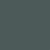
| Dark Grey
| |||
| Extra Brand Colors |
|
| |||
Sematic colors | Success
| Error
| 35 % Yellow
| 35 % Success
| 10 % Error
|
| Neutral colors | White
| 10 %
| 30 %
| 60 %
| Black
|


Frames & Shade Styles
- Box frames/lines in Medium Grey (#878787) only
- Other CD colors are allowed
- Red is used exclusively for Errors

Border
1 Px with

Border bold
4 Px with

Shade
1 Px with
Typography
- Helvetica Neue Regular is used as the default font
- Fallback font is the Arial
| H1 | Regular / 72 px |
| H2 | Regular / 48 px |
| H3 | Regular / 40 px |
| H4 | Regular / 32 px |
| H5 | Regular / 24 px |
| H6 | Bold / 18 px |
Headlines Banners & Cards
| Banner | Regular / 37 px |
| Card | Regular / 26 px |
| Product title | Bold / 24 px |
Bodytext
| Copy Big | Regular / 18 px |
| Copy | Regular / 15 px |
| Small | Regular / 13 px |
| Tiny | Regular / 11 px |
Typographic colors
- Copy font is always black
- Headlines can be black, white or gray
- Secondary gray color Medium Grey (#878787) is used only in labels
 |  |  |  |  |  |
| Primary color #000000 | Secondary color #575757 | White #FFFFFF | Success #00B54E | Error #E65516 | Medium Grey #878787 |
Buttons
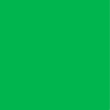
- CTA also possible in zero emission green
Button big (46 px)
| Primary #FFD511 |  |  |
| Hover Primary #D2AA00 |  |  |
| Secondary #575757 |  | |
| Hover #000000 |  |
|
| Tertiary / Textlink #000000 | Learn more |
Variations for all Buttons
| Button small (36 px) | |
| Button Text/Icon |  |
| Button Icon |  |
| Button Arrow |  |
UI elements
Text Inputs

Selects

Container
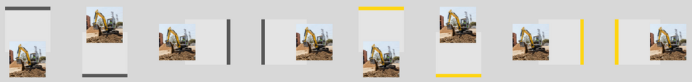
- Primary Box: Highlighter is always located opposite the image (if present)
| Primary Box | #F5F5F5 & #575757 / Stroke 4 px
| #F5F5F5F & #FFD511 / Stroke 4 px
| |
| Secondary Box | #FFFFFF / #575757
| Hover / Shadow #000000
| |
| Highlight Box | #575757
| #FFD511
| #00B54E
|


Miniature examples of hightlighter behavior as a style element
Standard table
Standard Actionbar
Website Design Elements
Authorized content managers can view documentation for all existing design elements here.

Example of a text & image element
Newsletter
Content width
| Element | Width |
| 100% elements | 600 px |
| 50% elements | 278 px |
| 33% elements | 180 px |
Colours
| Element | Color |
| Background in general | #FFFFFF |
| Background content | #F2F2F2 |
| Headline bars | #575757 |
| Buttons | #FFD511 |
Typeface
| Text type | Attributes |
| Continuous text |
|
| Headlines small |
|
| Headlines large |
|
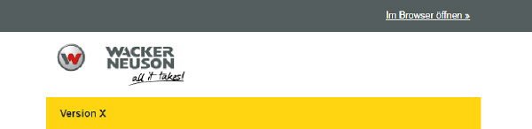
Header
- Grey bar with information "Open in browser", Colour: #575757
- Yellow bar with individual newsletter title, Colour: #FFD511
Content
This area can be compiled individually using templates. The templates have widths of 100% or 2 x 50% (exception: Promobox 3 x 33%).
The selection of possible templates and their design is here:
https://scnem2.com/a.php?sid=9om0.od87th,f=999
Footer
- Grey area – colour: #575757
- Font colour: #FFFFFF
