Print Basics
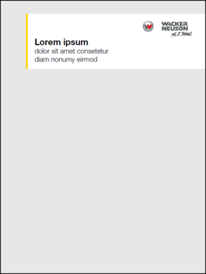
There are defined design elements for the cover design: A borderless image with a meaningful motif, the white communication module with Wacker Neuson logo, a yellow highlighter and headlines. These design elements are also used in other media.
Ideally, the communication module is positioned at the top right and its size can be adapted to the content.
Exceptions
Advertising designed media, such as campaigns or extreme special formats, can be designed without the communication module, if not possible otherwise.
However, the same basic principles for sizing apply to all designed media.

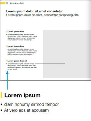
Highlighter
- The yellow highlighter is the special feature of the Wacker Neuson design.
- The highlighter is used in the communication module and for flags.
- For headlines, the element is used sparingly, e.g. for the walkaround headlines in brochures.
- Regular price labeling is always emphasized with the highlighter.
Communication module
Width of the highlighter
0,5 R
Text area
The width of the highlighter is the same as for the communication module
0,5 R
Headline
Highlighter width
Font size x 0,2
Height of the highlighter
= point size of the font
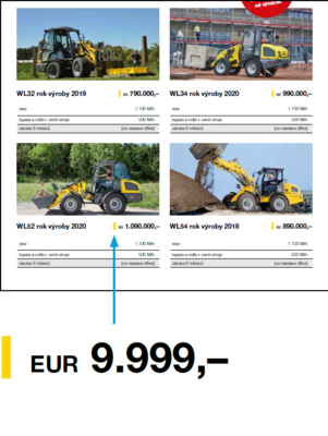
Price labeling
Highlighter width
Font size x 0,2
Highlighter height
= point size of the font
Type area & grid
Calculation formula R
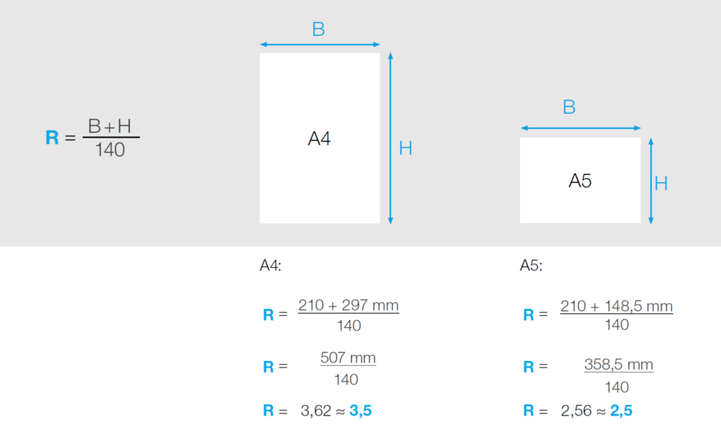
The basis for determining the page margin and type area is the unit R. It results from the format size of the medium.
The result is rounded up or down in 0.5 increments (to the next whole or half number):
4,80 ≈ 5,0
5,36 ≈ 5,5
The calculations refer to the dimensions of the area to be designed. For calendars, for example, the area of the calendar does not count as part of the area to be designed.
Minimum size for R: 1,5 mm
Calculation of the type area
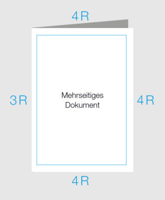
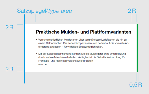
The type area is dimensioned differently depending on the type of medium. For double-sided documents, this avoids an excessively wide gutter. Single-sided documents have a uniform distance to the page margin all around.
Example brochure 210 x 279 mm
R = (210+279)/140 = 3,493 ≈ 3,5
Border top, outside and bottom:
4 R = 4 x 3,5 = 14
Border inside:
3 R = 3 x 3,5 = 10,5
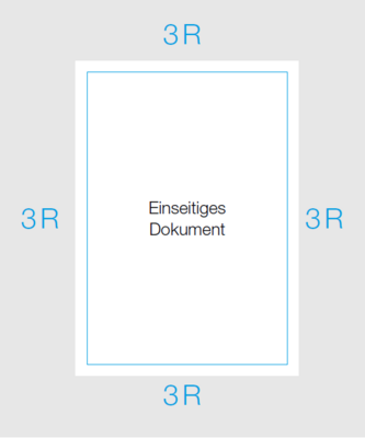
Example flyer A4
Border all around:
3 R = 3 x 3,5 = 10,5
Grid
Columns
This results in 12 columns with 4 mm spacing between them.
Baseline grid
Measured from the top of the page, the baseline grid starts after 3 R (DIN A4: 10.5 mm) with a division every 12 pt.
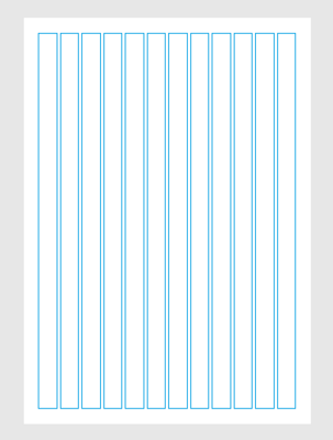
12-column grid
Column spacing (DIN A4): 4 mm
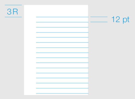
12 pt baseline grid
Copy texts, the first line of headlines and images are aligned to the baseline grid.
Communication module
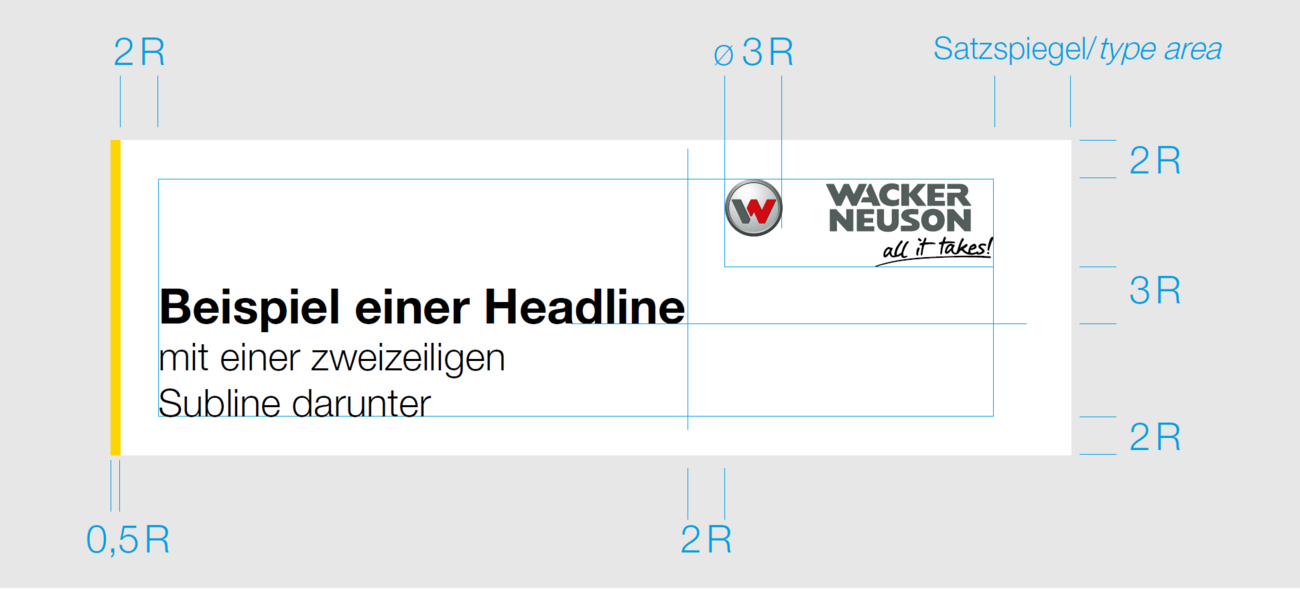
Logo size and spacing
- The size of the logo is derived from the diameter of the symbol.
- Diameter for the symbol: 3 x R
- The logo is right-aligned in the type area of the format. Within the module, the distance at the top, left and bottom is: 2 x R
- Calculation of the stroke width of the yellow highlighter: 0.5 x R
- Headlines are set in Bold and sublines in Light.
Communication module (example DIN A4)
Border top, left and bottom:
2 R = 2 x 3,5 = 7
Logo size (W circle)
3 R = 3 x 3,5 = 10,5
Line width of the yellow highlighter:
0,5 R = 0,5 x 3,5 = 1,75
Protective space for the logo in the communication module
- The communication module should not be too large in order to cover as little of the image as possible. Therefore, the headlines should be short.
- The protective space for the logo in the communication module is 3 R down and 2 R to the left.
- For a 3-line headline/subline, the baseline of the headline is level with the lower boundary of the protective space. The text should not undercut the protective space of the logo.
- In the case of a 2-line headline/subline, the sinking line of the headline is at the level of the lower boundary of the protective space. The text may undercut the logo, but should not extend beyond the right edge of the logo's word mark.

3-line headline/subline
The baseline of the headline is at the level of the lower boundary of the logo's protective space. No undercutting of text and protective space of the logo.

Headlines to the left of the logo
The baseline of the headline is at the level oft the lower boundary of the logo's protective space. No undercutting of text and protective space of the logo.

Communication module without headline
If only the logo is shown in the communication module, the distance downwards is also reduced to 2 R.

2-line headline/subline
The sinking line of the headline is at the level of the lower boundary of the logo's protective space. Undercutting of text and logo is
allowed.

Headline undercuts the logo
The sinking line of the headline is at the level of the lower boundary of the logo's protective space. Undercutting of text and logo is allowed.
Positioning of the communication module
Vertical alignment
To prevent essential image areas from being obscured, the vertical position of the communication module within the typesetting area can also be freely selected. Preferably, the module should be placed rather on top of the page.
Horizontal alignment
The communication module is always aligned to the right. Only in exceptional cases (in order not to cover essential image elements) a left-justified alignment is permitted.

Vertikal alignment
The communication module may be freely positioned on the vertical axis within the type area.

Basically right-justified
The communication module is postioned on the right edge of the format.

Left-aligned in exceptional cases
If the communication module obscures important image areas, it may also be left-aligned in the format in exceptional cases. The defined spacing remains.
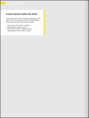
Typography
- Basically, the house font Helvetica Neue LT W1G is used.
- As a rule, left-justified flat type is used.
- Headlines are set in Bold and can be supplemented with a subline in Light.
- Body text is set in Light.
- For bulleted lists, a square is used as bullet point.
Text- & image elements
Textelements
Communication module without logo
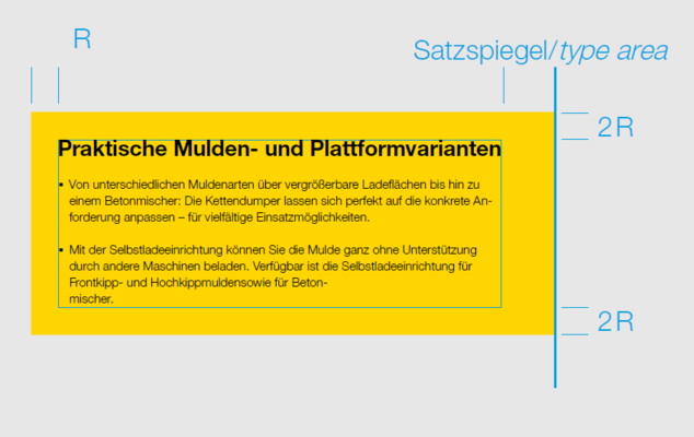
To display texts on images, the communication module without logo is used. The yellow or green (zero emission communication) hightlighter is always used on the vertical side facing inwards.
Flags
Colored areas can also be used, with the restriction that they must not have an upward or downward edge.
Communication module without Logo
Flags
Disturber
To get a clear contrast to the angular design elements, the disruptors have a circular shape. The standard colors for disruptors are red or yellow, while zero emission content is specifically highlighted by green disruptors. The diameter of the disruptor is freely selectable.
Position
Disruptors can be placed on an image or white space. Overlaps are allowed.
Typography
Helvetica Bold and Light, centerline, maximum 4 lines, ZAB 130 % Inclination of text: 10 ° counterclockwise.
Minimum margin distance in the disturber
The distance of the typography to the edge of the disturber is 5 % of the diameter.

Example calculation
Diameter 50 mm x 5 % = 2,5 mm
Image elements
Borderless images
- Images can be inserted into the format with margins on 4 sides, e.g. on title pages, double pages or intertitles.
- Also possible is the edge drop insert on 3 sides as well as 2 sides.
Images on the grid
The images are aligned to the grid.
Full screen

Borderless images on 3 and 2 sides
Borderless images in the grid
Tables & backgrounds
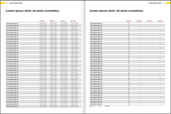
Tables
In general, tables are open to the sides, every second line is grayed out. The lines are separated by a line. Headers and intermediate headlines are delimited with wider lines. The cell height is at least 14 pt.
Table font
For typesetting, both left and right justified, as well as axial typesetting is allowed. The font does not run on the baseline grid and can be set vertically if necessary to save space. Machine designations are set in Wacker Neuson machine font.
Lines
All lines are bounded by a horizontal line at the bottom. Line width: 0.3 pt. The line below the header and above and below an intermediate headline is 0.75 pt. Vertical lines are used as separators when columns are close together. The line width is also 0.3 pt.
Areas
The lines have an alternating 13 % black background.
Backgrounds
Concrete Backgrounds
Concrete backgrounds are available in two variants for the representation of exempted machines - these are always to be added with standing and cast shadows:
- Gray fading for use in the grid (lightest color value in the image 0/0/0/7)
- White-bleeding for the edge-bleeding display
Both variants can be downloaded from the Mediapool.
White background
Exposed machines and devices can also be placed on a white background.

Background in grid
Dark concrete background, the lightest CMYK color value in the image is 0/0/0/7.

Background borderless
The concrete background fads into white.

White background
For clipping with shadows.
Templates
To make it easier for you to get started with Wacker Neuson Print, some InDesign templates are available for download in the Mediapool:
- Brochures - World format 210 x 279 mm
- Invitation cards - DIN long format
- Offer flyer 1-sided & 2-sided - DIN A4 format